#070817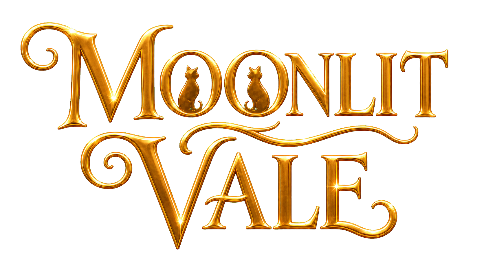
Identity and media guide
The Moonlit Vale Brand Book
A guide to the colors, marks, materials, and storybook principles that make every path into Moonlit Vale feel like part of the same living world.
Primary identity
Marks from the Vale
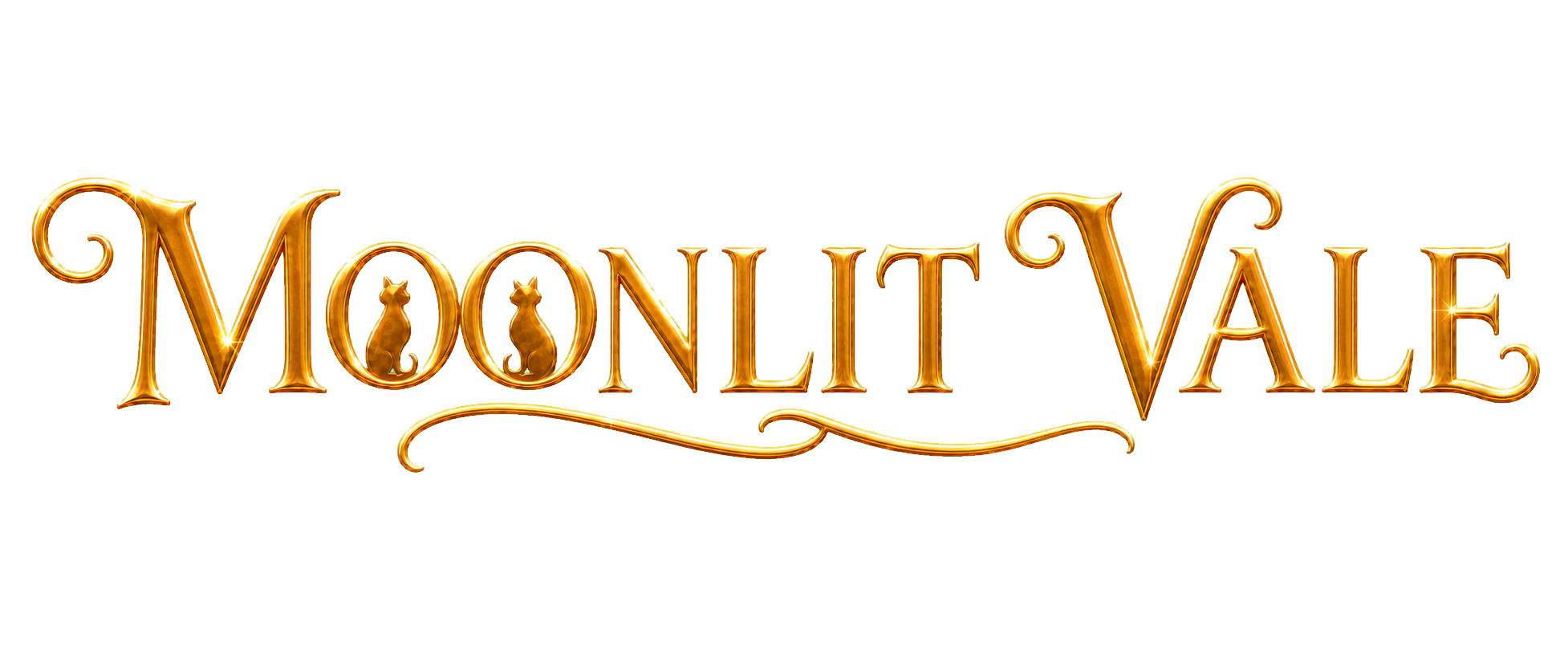
The gold cat wordmark carries warmth, mystery, and two watchful companions. Preserve its gleam, proportions, and generous breathing room.
Colors of the Vale
Moonlight, parchment, and lantern glow
The palette moves between deep night and readable warmth. Exact values matter; new near-duplicates do not become brand colors by accident.
#171D40#6F5CA8#F8EDC9#D9B45B#F3E4B9#2C211C#E6A84E#334F3D#F1D98DDesign principles
Every open path should feel real
Moonlit Vale is welcoming without losing mystery, crafted without hiding how to navigate, and magical without becoming glossy or generic.
Safe to return to, brave enough to matter
Lantern warmth and hearthside comfort coexist with old paths, hard choices, and moonlit uncertainty.
Objects carry the visual language
Books, maps, signs, boards, parchment, wood, cloth, and framed art feel made by hands inside the Vale.
Wonder never hides the way forward
Semantic text, normal links, readable hierarchy, visible focus, and mobile recomposition keep every journey understandable.
Beauty supports meaning
Magic feels practical, relational, and grounded. Ornament creates atmosphere without replacing content or accessibility.
Artwork direction
Painterly, tactile, and quietly alive
Refined gouache and watercolor texture, soft ink edges, natural medieval materials, moonlit depth, and lantern warmth create a world that feels illustrated rather than rendered.
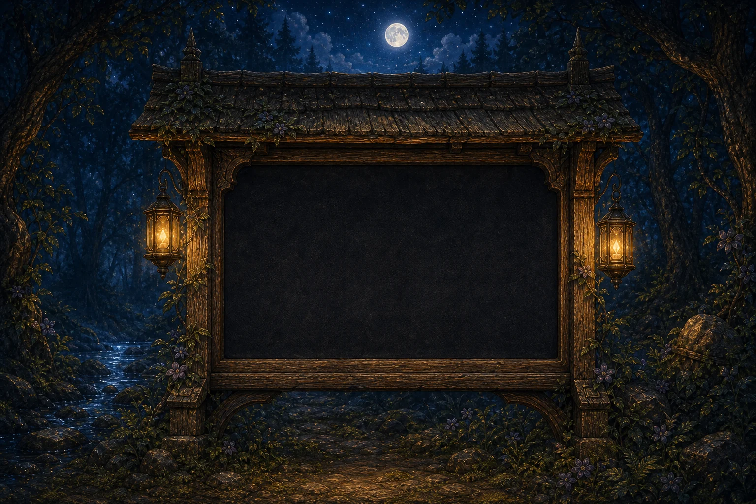
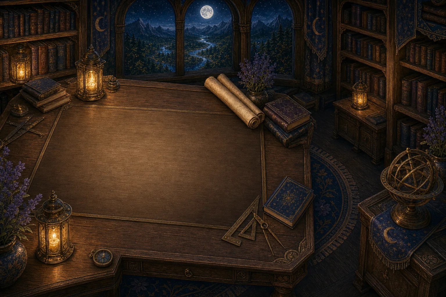
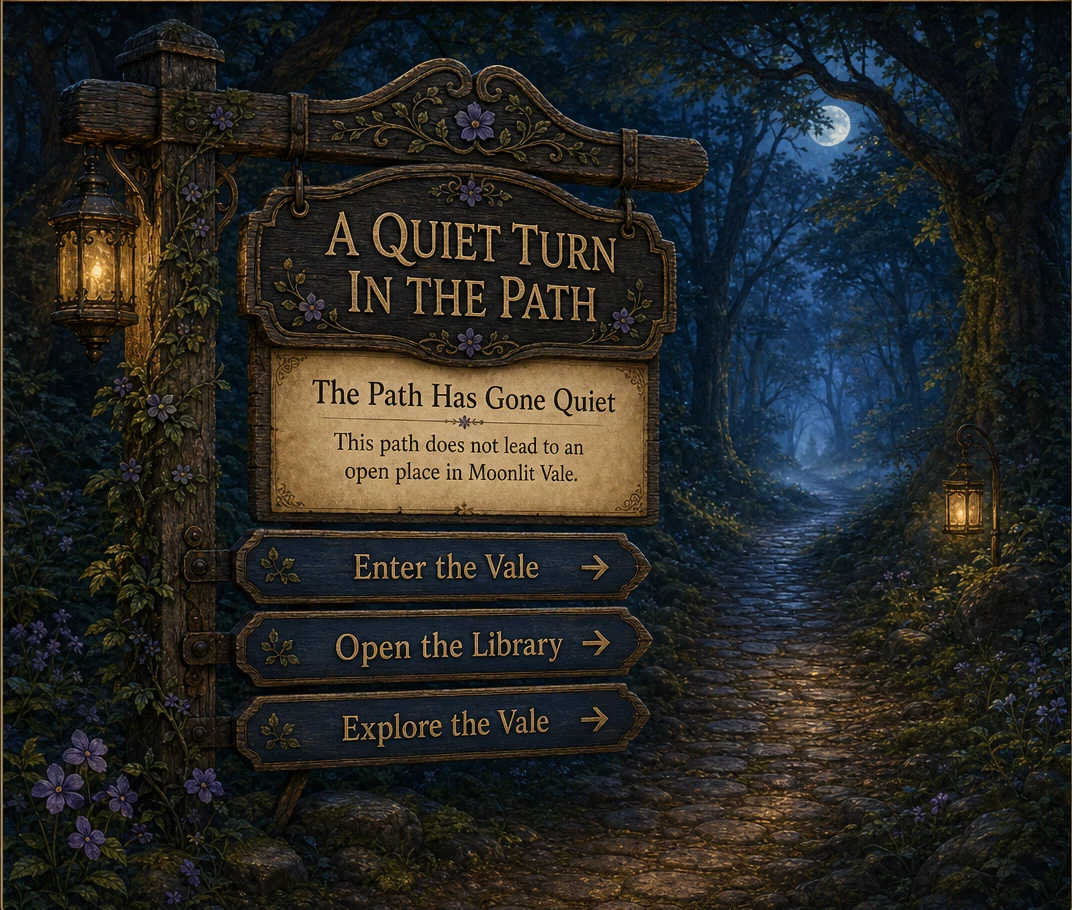
Use with care
Keep the magic legible
Brand richness and accessibility belong to the same system. Important words and journeys must remain understandable even when artwork, fonts, or motion are unavailable.
Keep
- Original proportions and clear space around every mark
- White-gold gleams and the two seated cats in the wordmark
- Readable contrast, source-backed alt text, and visible focus
- Live prose, dates, changing labels, and semantic navigation
Avoid
- Stretching, recoloring, outlining, or cutting apart the marks
- Generic pet branding, glossy SaaS fantasy, grimdark, or battle-first imagery
- Long body copy baked into images
- Invented lore, unsupported characters, or public production language
Media essentials
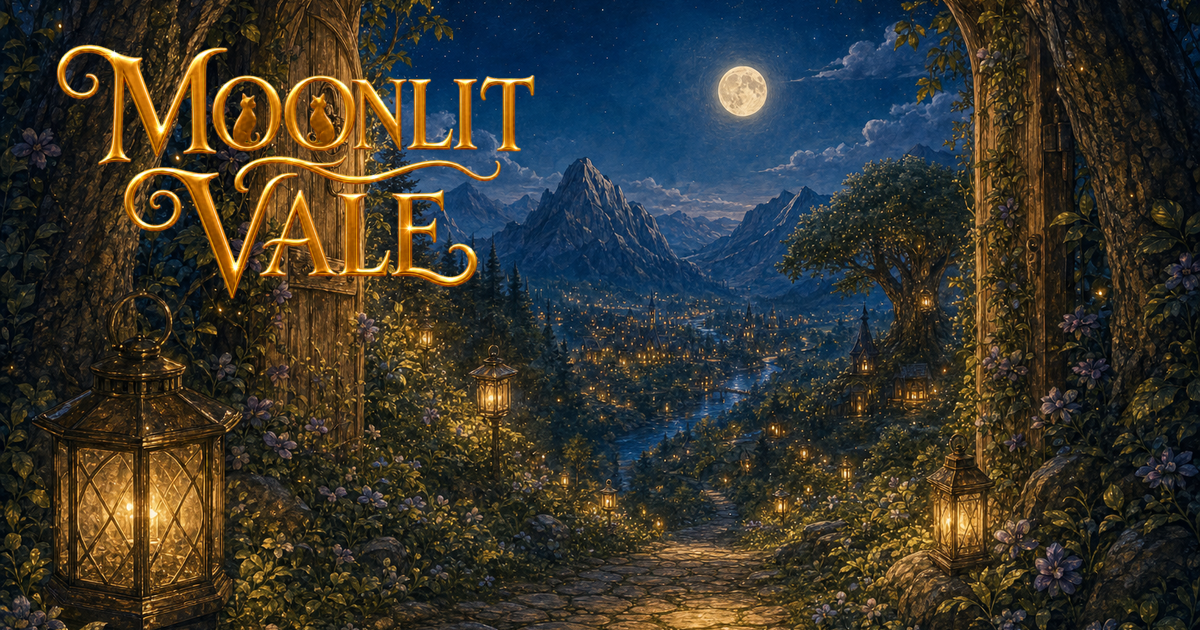
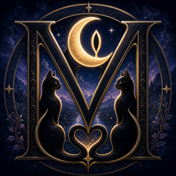
Use the approved marks and social image as supplied. The favicon is the compact crescent identity for browser and app-size placements.